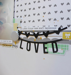
I went for a very simple design and kept the patterns and embellishments in the top third of the page. Much like I did for my previous two FJ layouts, I used the stamped images that I had pre-stamped and cut, as embellishments. It absolutely helps me make use of them. I will be doing that with my next kit as well! Let me know if you try it too!
I absolutely adore these black die cut pieces, and almost hoarded them, but the strong black against the grey of the patterns was too beautiful to resist. I also love the contrast it had against the bright glare in the photo. Again, not the most perfectly taken photograph, but I like it. :)
Here is the finished product. Let me know what you think!
I hope you have enjoyed the two layouts every Thursday last month. I enjoyed creating them! I am hoping to continue posting two layouts every week, although there will only be one on Thursdays, and I have decided to start a new series on Saturdays. Tune in this Saturday for the first video of our new series "Smash your Stash Saturdays." In the meantime, check out this process. :)
xo Imelda


No comments:
Post a Comment